MAF Carrefour, Dubai, UAE. Retail store operations.
SMAPP, the Vendor Stock App
A mobile app that helps vendors quickly check stock information, product details, and store requirements while working with Carrefour.
My role
Senior product designer. Research, app structure, wireframes, UI and handoff.
Who uses it
Vendors and store teams
Scope
Home, navigation, product details, scan, user management, profile and FAQ
Platform
iOS and Android
The problem
Vendors had to spend a lot of time checking stock and product information.
What I did
I made the app simple and easy to use, so vendors can quickly find the information they need.
The result
Vendors can quickly check stock, view products, and take action.
SMAPP after the redesign: product list, stock, home add user and sales.
02
The problem
Every day, vendors need to know what is in stock, what is running low, and which products need attention. The old app had this information, but it was not easy to find.
What vendors need to do
Check the stock of a product
See which products are running low
Check product prices and details
Check product status
Get the information quickly while working in the store
What made it hard
On the move
Vendors use the app while walking around the store.
Busy stores
Information needs to be easy to read at a glance.
Stock data
Stock numbers come from store systems and scans.
Many tasks, one app
Managers, vendors, IT and admins all use it for different jobs.
Two platforms
The same design needs to work on iOS and Android.
Help vendors quickly find stock and product information without making the app difficult to use?
03
Users & context
SMAPP is mainly used by vendor teams to check their products and stock in Carrefour stores. The app helps them quickly see what is available, what is running low, and what needs attention.
User
What they need from SMAPP
Vendor teams (main user)
Check their products, stock levels, prices and availability.
Store teams
Check product and stock information in the store.
IT and admins
Add and remove users and manage access.
Where the stock information comes from
The stock information comes from store systems and shelf scans by Robots. SMAPP brings this information together so vendors can quickly understand the status of their products.
1
Tally scans the shelf
A robot scans the shelves to check which products are available, missing, or running low.
2
Store system updates
The scan updates the stock and product information in the store system.
3
SMAPP shows the problems
Vendors can see stock levels, product availability, prices, and products that need attention.
4
Vendor takes action
Vendors can follow up on low-stock or unavailable products.
The app does not collect the stock data manually. A robot scans the shelves and checks product availability. SMAPP brings this information together so vendors can quickly see the stock status of their products.
SMAPP turns shelf scans into simple stock information for vendors.
Tally, the shelf-scanning robot, working a Carrefour aisle.
04
Research
I studied the existing app, looked at the business requirements, reviewed similar retail apps, and spoke with the project team to understand how vendors check their products and stock in stores.
What I found, and what I changed
What I foundWhat I changed
01
Finding products was not easy
Vendors had to go through different screens to find their products.
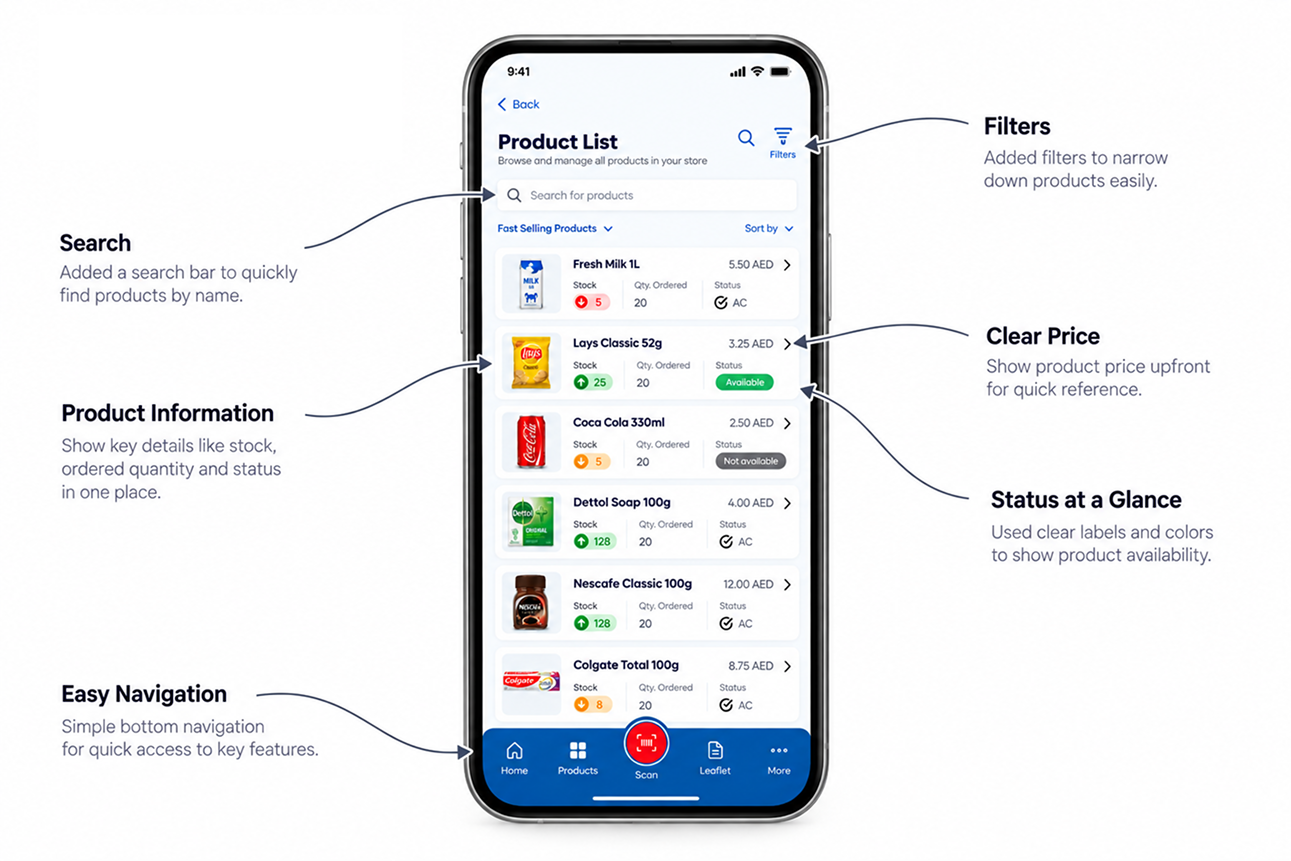
Made product search and navigation simple. Vendors can quickly find a product and open its details.
02
Product information was spread out
Stock, price and sales information were in different places.
Put product information in one place. Stock, Label and Sales are shown together.
03
It was not clear which store the data
was for Vendors could work with different stores, so they needed to know which store they were viewing.
Showed the country and store at the top. This makes the selected store clear.
04
Low-stock products were hard to find
Vendors could not quickly see which products were low or unavailable.
Added a quick stock summary and clear status labels. Vendors can see low-stock and available products faster.
05
Common tasks were hard to find
Vendors had to search through the app for things they use often.
Put common tasks on the Home screen. Less-used options were moved to More.
The product list after the changes. Price, stock, amount ordered and status are visible without opening the product.
05
App structure
I organised the app around what managers do most. Each bottom tab is one job, so users always know where to go.
Bottom bar
Home
Today at a glance
Quick actions
Store management
Products
Product list
Product details
Stock
Label
Sales
Scan
Scan a product
Product details
Leaflet
Promotion products
More
Profile
Manage users
Access management
FAQ
Five bottom tabs, one job each. Scanning a product opens the same product page as the list, so users learn one layout.
The three main flows
Check a product
Product list→Product details→Stock, Label or Sales→Back to list
Scan a product
Any screen→Scan→Product details
Manage users
More→Manage users→Select users→Add or delete
06
Key decisions
Four design decisions helped make SMAPP easier for vendors to use.
Decision 1 of 4
Show stock problems first, not just the menu
The problem
Vendors opened the app to check their products, but the important stock information was not easy to see.
What I did
I added Today at a glance at the top of Home. It shows three important numbers:
Low stock
Available products
Expiring soon
Why
The shelf-scanning system already finds these stock issues. The app should show them clearly so vendors can understand the situation quickly.
The trade-off: this section takes some space on the Home screen, but it helps vendors see important information without searching.
UAEGrand Mosque area
Good morning
Today at a glance View details
5Low stock
12Available
3Expiring soon
The top of Home. The store is always shown first, then the summary.
Decision 2 of 4
One product page, three tabs
The problem
Stock, label and sales information for a product was shown in different places.
What I did
I put all the information on one product page with three tabs:
Stock — How much stock is available?
Label — Is the product price and label correct?
Sales — How is the product selling?
Why
Vendors can find all the important information about a product in one place.
The trade-off: tabs hide some information until they are selected. To solve this, I kept the product name, price and status visible at the top.
Stock, Label and Sales. The Label tab matters because Tally also finds wrong prices on the shelf.
Decision 3 of 4
Put common tasks on Home
The problem
Vendors use some tasks more often than others, but these tasks were difficult to find.
What I did
I added common tasks directly to the Home screen, such as:
Product List
Tally Report
Product Price Change
Competitor Price Survey
Favourites
Less-used options were moved to More.
Why
Vendors can reach the tasks they use most with fewer taps.
The trade-off: there are many features in the app, so I grouped them into simple sections instead of showing everything at once.
Wireframes: Home with the grid, the product list, and the More menu for rare tasks.
Decision 4 of 4
Keep Scan easy to reach
The problem
Vendors may need to scan a product while moving around the store. The Scan button should be easy to reach with one hand.
What I did
I placed Scan in the middle of the bottom bar and made it larger than the other buttons.
I kept the Back button at the top, where users normally expect it.
Why
The bottom of the screen is easier to reach with a thumb, especially when vendors are walking around the store.
The trade-off: the Scan button takes more space, but it makes the most important action easier to access.
EasyStretchHard
Thumb reach for right-handed, one-handed use.
The goal was simple: help vendors find a product, check its stock, and take the next action with fewer steps.
07
Accessibility
The app needs to be easy to use while vendors are walking around the store, using one hand, and working in different lighting conditions. It also needs to work in English and Arabic.
Easy to tap
Buttons and touch areas are large enough to tap easily, even while moving.
Do not use colour alone
We use text and icons along with colour to show product status.
✓Available✕Not available!Low stock
This helps users understand the status even if they cannot tell the colours apart.
Easy to read
Important information such as stock, price and product status is easy to see. Less important details are smaller.
Easy to find your way
The Back button stays in the same place, and the selected tab is clearly shown.
Clear states
Selected, disabled and active buttons look different. Required steps are clearly shown.
Built for Arabic
The layout supports right-to-left Arabic text and leaves enough space for longer Arabic labels.
Colour system
I kept the colours few and simple. Each colour has one job, and text on it is easy to read.
Deep blueHeaders and active tabs11.6:1 with white
BlueNavigation and main actions8.0:1 with white
RedScan and delete4.7:1 with white
Light bluePage background6.9:1 with blue text
WhiteCards and data fields
All pairs pass WCAG AA contrast for normal text (4.5:1 or higher).
08
Final screens
From sign in to store selection, Home, products, users and help.
Sign in and pick a store, then Home and the product list.Manage users, product sales and FAQ.
For this case study I refreshed the visual style of the screens. The structure, features and flows are the same as the app.
09
Outcome & next steps
The redesign gives vendors a clear and simple way to check their products and stock.
BeforeAfter
Vendors had to search for product information
→
Product information is easier to find
Stock, price and sales were in different places
→
Stock, Label and Sales are on one product page
It was not always clear which store was selected
→
Country and store are shown at the top
It was easy to get lost between screens
→
Clear bottom navigation and Back button
Common tasks were hard to find
→
Common tasks are available from Home
A note on results
I did not have enough real usage data from the stores, so I have not added made-up numbers.
What I would do next
Make stock information more trustworthy. The shelf-scanning system can sometimes be wrong. A product may be hidden or the label may be difficult to read.
I would add:
Last scanned time
A simple way to report incorrect stock
A way for vendors to confirm when the stock information looks wrong
What I would measure. I would track:
How long it takes to find a product
How quickly vendors can check stock
How often vendors use Scan
How often incorrect stock is reported
How often users go back because they cannot find something
What I learned
Design for the real situation. Vendors use the app while walking around the store, so buttons need to be easy to tap and important information needs to be easy to see.
Start with the data. The stock information comes from shelf scans, so the design should help vendors understand and trust that information.
Use simple names. I used names like Stock, Label and Sales because they are easy for vendors to understand.
The goal was simple: help vendors find their products, check stock, and understand what needs attention quickly.