01 · Overview
What I Owned, And What Was At Stake.
The biggest challenge wasn't the visuals. It was designing — from a blank canvas — for finance teams who had been living inside Excel for over a decade. The job was to give them something better without making them feel like they had to relearn everything they trusted.
- End-to-end UX strategy
- Information architecture
- Interaction design
- Usability testing
- Visual polishwith visual designer
- Research synthesiswith UX researcher
- Product prioritieswith PM
- Engineering implementation
- Final QA & testing
- Sprint planning
- Stakeholder reporting
02 · The Problem
Excel Was The System — And Also The Bottleneck.
Before DigiComputax, tax professionals at E&Y's client firms relied entirely on Microsoft Excel to manage complex tax calculations and compliance workflows. Familiar, yes — but the approach created serious operational risks.
High Error Risk
Complex Excel formulas broke silently. One wrong cell reference could cascade into compliance violations worth crores of rupees.
No Audit Trail
There was no visibility into who changed what, when. Compliance reviews became extremely painful and time-consuming.
Wasted Hours
A large portion of each week went into validation and rework. Most of that wasn't analysis — it was hunting down avoidable mistakes from earlier in the chain.
No Collaboration
Files passed via email. Multiple versions existed simultaneously. Teams had no shared source of truth.
The process was slow and error-prone, but the biggest challenge was that users were deeply comfortable with Excel. So the product had to feel familiar — otherwise adoption would fail.
03 · The Challenge
Keep it familiar. Make it organized.
Users depended on Excel for its flexibility, but that flexibility also led to manual errors, inconsistent workflows, and limited traceability. Our goal was to preserve the familiarity of Excel while creating a more structured and reliable experience.
04 · Research & Insights
Before Any Pixel, A Lot Of Listening.
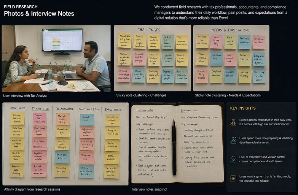
I didn't want to design from assumptions. Finance teams had been burned by tools that "looked nice but didn't fit" too many times — and I needed to understand exactly why before drawing a single screen.
interviews
tax platforms studied
inquiry sessions
patterns identified
Interview
1:1 sessions with tax professionals across experience levels
Observe
Sat with users while they worked through real Excel files
Synthesize
Pulled themes into patterns we could design against
Our Users
Our primary users were finance professionals — accountants, tax analysts, and finance managers. They regularly handle:
- Tax calculations and filings under tight regulatory deadlines
- Large, interconnected financial datasets
- Time-sensitive tasks where errors can have legal consequences
Most of them were highly experienced and heavily dependent on Microsoft Excel. Any product that felt unfamiliar would face immediate resistance.
Research Approach
We ran both primary and secondary research so we weren't just guessing at user behaviour from the outside.
Primary Research
- 6 interviews with tax professionals across experience levels
- Sat with users while they worked through their actual Excel files
- Tracked where things broke — usually in validation and reconciliation
- Mapped how people think about their data, not just how they enter it
Secondary Research
- Read through the Indian tax compliance rules users had to follow
- Pulled apart 3 competing tax platforms to see what worked
- Looked at how the broader finance industry handles similar workflows
- Studied where existing finance tools tend to fail their users
04b · Primary Persona
Meet Priya
Across every interview, one user kept showing up — the experienced tax professional whose entire workflow lived inside Excel. She became the person every design decision had to answer to.
- Spends hours hunting cell errors during tax season
- No version history when files break or get overwritten
- Can't collaborate without emailing files back and forth
- Manually re-verifies every formula before submission
Close the month accurately and on time — without breaking the muscle memory she's built over a decade in Excel.
Keyboard shortcuts. Formula syntax. Spreadsheet grids. The freedom to structure her data the way her brain works.
"Users didn't want a completely new system. They wanted a tool that felt like Excel but worked smarter — so they didn't have to think about complex rules all the time."
05 · Key Findings
What We Learned.
Five patterns showed up across almost every interview. They ended up shaping every major decision we made later.
Users trust Excel deeply
They're comfortable with formulas, grids, and manual control. The familiarity itself is a feature — not something to disrupt but to build upon.
Learning new tools feels risky, not exciting
Users would rather work in a broken Excel they know than a new tool that might break in ways they don't yet understand. The fear isn't of learning — it's of breaking something during tax season.
Speed matters more than features
Tax filing deadlines are fixed, so even small delays in the workflow can create pressure for teams during high-volume filing periods.
Errors are genuinely costly
Even small mistakes in tax calculations can trigger audits or financial penalties. Users double-check everything because they don't trust the tools — a massive cognitive load.
Formula compatibility is non-negotiable
Users wanted to paste their existing Excel formulas directly. They'd resist any tool that required relearning syntax they'd spent years mastering.
Core Insight: Users didn't want a completely new system. They wanted a tool that feels like Excel but works smarter — so they didn't have to think about complex rules all the time.
How We Stacked Up Against Existing Tools.
Before designing anything, we mapped what the existing tax tools were doing well — and where they were leaving users behind. The gap we wanted to fill was clear once we put them side by side.
No competitor combined Excel-level familiarity with enterprise-grade validation, audit trails, and real-time collaboration. That gap became our design opportunity.
06 · Design Principles
Four Principles That Guided Every Decision.
Before any wireframes got drawn, we wrote four rules on the wall of the design room. Every later decision had to pass them — or it didn't ship.
Maintain Excel familiarity.
Grid layout, keyboard shortcuts, and formula behaviour needed to feel like home. We were extending Excel — not replacing it.
Reduce errors through validation.
Real-time validation, structured input fields, and automatic calculations would silently catch mistakes before they became compliance problems.
Simplify complex workflows.
Multi-step tax processes needed clear, logical paths. No dead ends, no guesswork about what to do next, no buried forms.
Improve visibility & control.
Every change tracked. Every calculation explained. Users needed to feel in control — never surprised by the system.
07 · Ideation & Process
Early Wireframes Explored How To Balance Flexibility With Structure.
Before opening Figma, we sketched on paper. Cheaper to throw out a bad idea on a napkin than to throw out two days of pixel work. PMs and engineers sat in these sessions, so everyone owned the direction by the time we moved to high fidelity.
Design Process
Five stages, but not a waterfall. We tested ideas with users at every stage — including the messy ones — so we weren't waiting until launch to find out what wasn't working.
Research
User interviews, contextual inquiry, workflow mapping
Ideation
Workshops, sketching, low-fidelity prototypes
Design
Hi-fi mockups, interaction design, design system
Testing
Usability testing, A/B testing, feedback loops
Launch
Phased rollout, training, continuous improvement
08 · Components
Components Built For Consistency At Scale.
A walkthrough of the key components that made up the final product. Each was tested with real users before handoff to engineering.
09 · High-Fidelity Designs
The Final Product — Familiar On The Surface.
A walkthrough of the screens that ended up shipping. The visual language stayed close to spreadsheets on purpose — but everything underneath had been rebuilt to handle validation, audit, and collaboration properly.

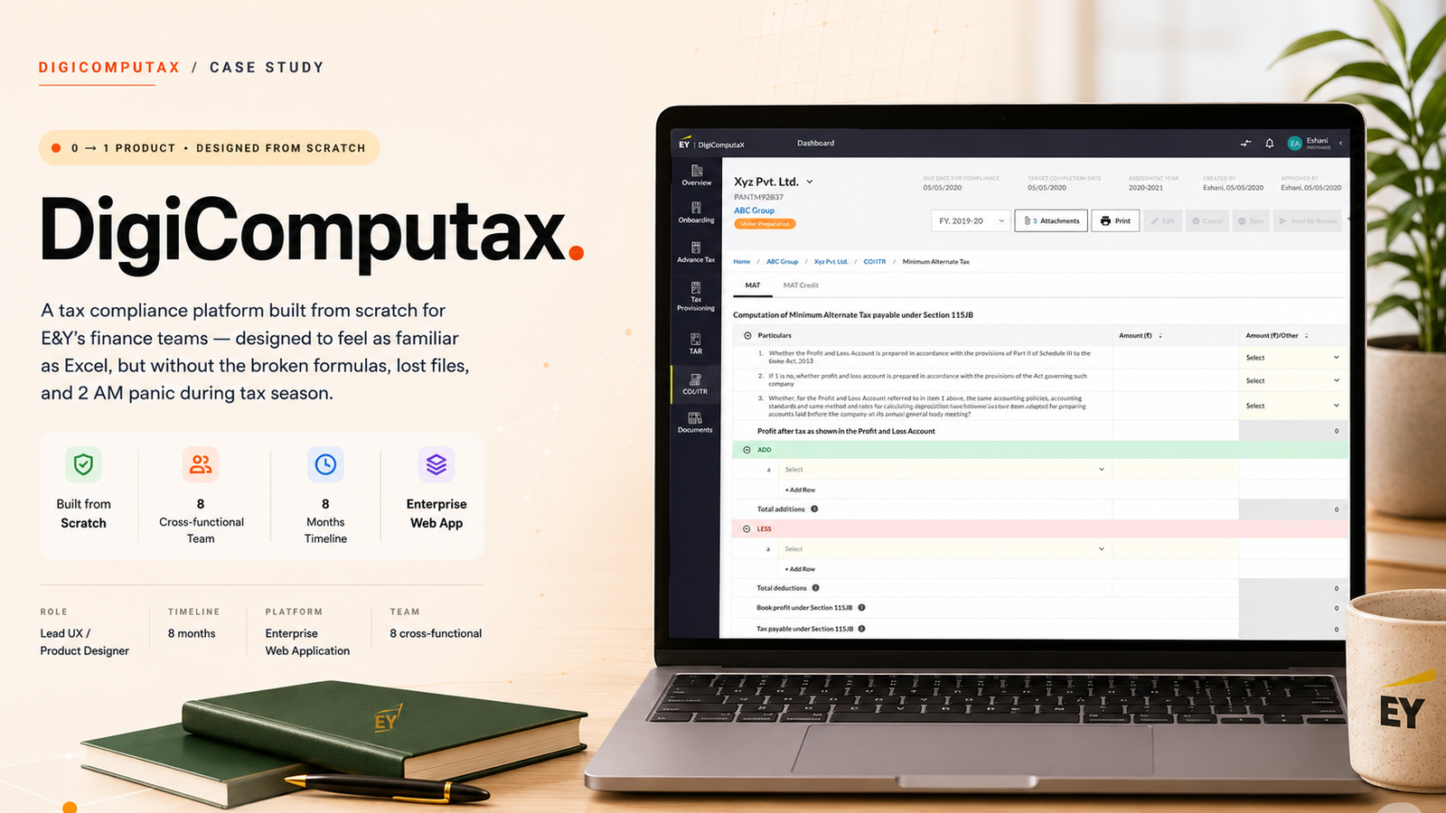
Minimum Alternate Tax (MAT)
The MAT screen handles one of the messier calculations in Indian tax law — Minimum Alternate Tax under Section 115JB. Users enter their financials in structured sections, and the system does the rest. No more =IF(B2>0,B2*0.185,"") formulas quietly breaking in row 47 of a thousand-row sheet.
Spreadsheet-like grid
Preserves the muscle memory finance teams already have. No new mental model to learn.
Inline validation
Errors surface at the cell level the moment data is entered — not after submission.
Built-in audit trail
Every change is tracked and attributable. Compliance reviews stopped being detective work.
10 · Outcomes
What Actually Changed.
This was a 0 → 1 product, so there was no "before state" to measure against. Instead, here's what we observed across usability testing, stakeholder reviews, and the engineering handoff — the kinds of wins that don't always show up in a chart, but matter just as much.
Familiar from first click
Users navigated core flows without onboarding
Errors caught at entry
Test users self-corrected before submitting
Clean engineering handoff
Reusable components cut rework significantly
Stakeholders aligned
Compliance and finance approved without major rework
By respecting the workflows users already trusted, we built a modern finance tool that didn't feel modern — it felt like the version of Excel they'd always wished they had. Skeptical Excel loyalists became the people championing the tool to other teams. That handoff — from us pushing the product to users pulling it — was the real win.